

In today's digital landscape, where users access content from a myriad of devices, ensuring a seamless and accessible experience is paramount. In this post, we explore the significance of responsive design in SharePoint and how it aligns with Credent Infotech Solutions' commitment to delivering top-notch solutions.
Introduction to Responsive Design
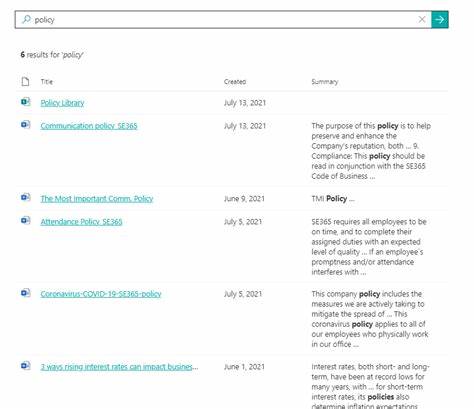
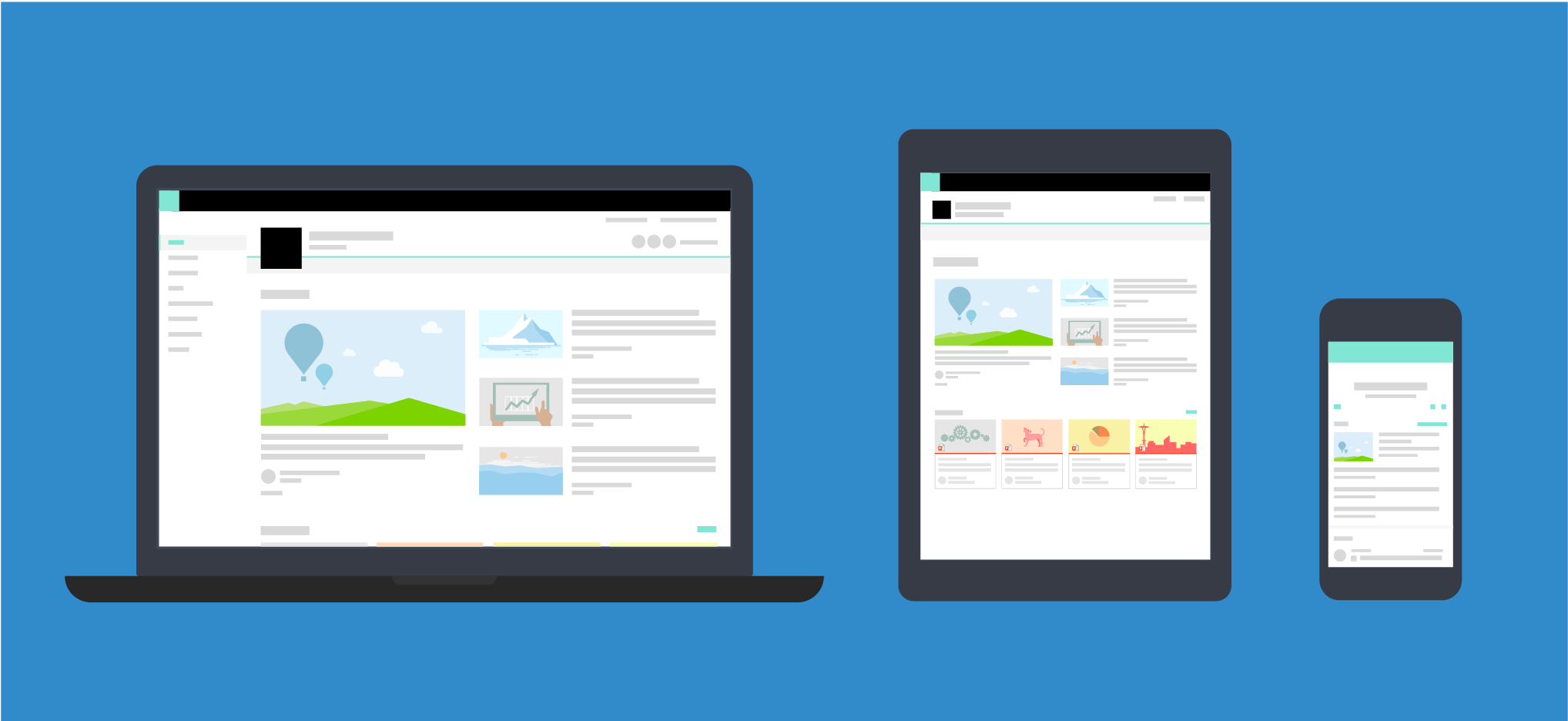
Responsive design is the key to providing a consistent and user-friendly experience across various devices. It involves crafting a website or application that automatically adjusts its layout and elements based on the screen size, ensuring optimal functionality and readability.
Why Responsive Design Matters for Credent Infotech Solutions
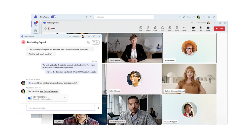
At Credent Infotech Solutions, we understand that our clients and their users interact with SharePoint solutions on a multitude of devices. Whether it's a desktop, tablet, or smartphone, responsive design ensures that everyone, regardless of the device they use, has a seamless and enjoyable experience.
Key Features of Responsive SharePoint Sites
Our SharePoint solutions leverage responsive design principles, including adaptive layouts, flexible grids, and CSS media queries. This ensures that the content we deliver looks and functions flawlessly on screens of all sizes, providing a consistent brand experience.
Implementing Responsive Design with Credent Infotech Solutions
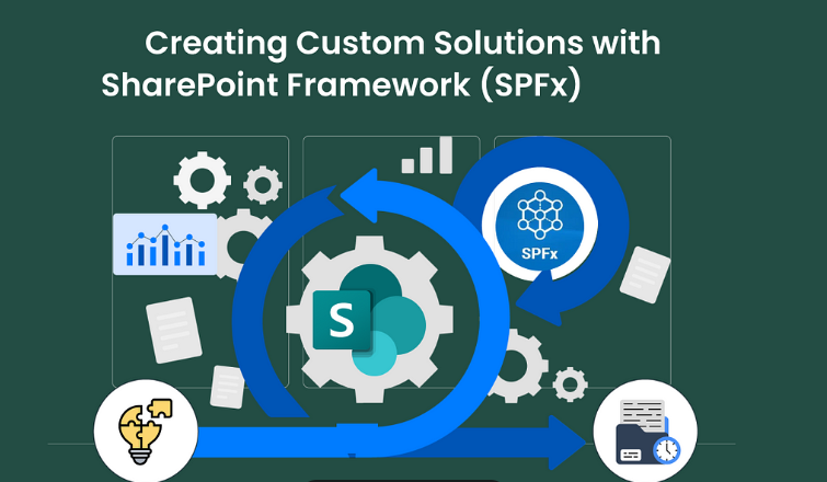
Our team at Credent Infotech Solutions excels in implementing responsive design in SharePoint. We tailor modern SharePoint themes, customize master pages and page layouts, and leverage SharePoint Framework (SPFx) for responsive web parts. This approach guarantees that our clients' SharePoint environments are optimized for accessibility across devices.
Testing and Debugging for Perfection
Credent Infotech Solutions prioritizes thorough testing and debugging to identify and rectify any responsiveness issues. We employ cutting-edge tools to ensure that your SharePoint solution functions seamlessly on every device, minimizing disruptions and maximizing user satisfaction.
Best Practices for Responsive SharePoint Sites
For us, delivering excellence means adhering to best practices. We prioritize content prioritization, image optimization, and touch-friendly navigation to enhance the user experience and ensure that your SharePoint site is accessible to all.
Realizing Success: Case Studies
Credent Infotech Solutions takes pride in showcasing success stories. Discover how our responsive design implementations have positively impacted user engagement and productivity in real-world scenarios.
Future Trends and Considerations
As a forward-thinking company, we explore emerging trends in responsive design. Stay ahead of the curve with insights into how evolving technologies may shape the future of SharePoint responsiveness.
Training and Adoption for Your Team
Credent Infotech Solutions not only delivers solutions but also empowers your team. Find practical tips for training end-users on responsive SharePoint sites and addressing common concerns.
Resources and Tools from Credent Infotech Solutions
Explore our curated collection of resources, tutorials, and tools designed to support your journey towards responsive and accessible SharePoint solutions.
In conclusion, at Credent Infotech Solutions, we are dedicated to delivering SharePoint solutions that transcend device boundaries. Our commitment to responsive design ensures that your users have a seamless and enjoyable experience, fostering productivity and engagement.
Stay tuned for more insights from Credent Infotech Solutions – where innovation meets excellence!